Date: October 2022
Project: Visual Identity
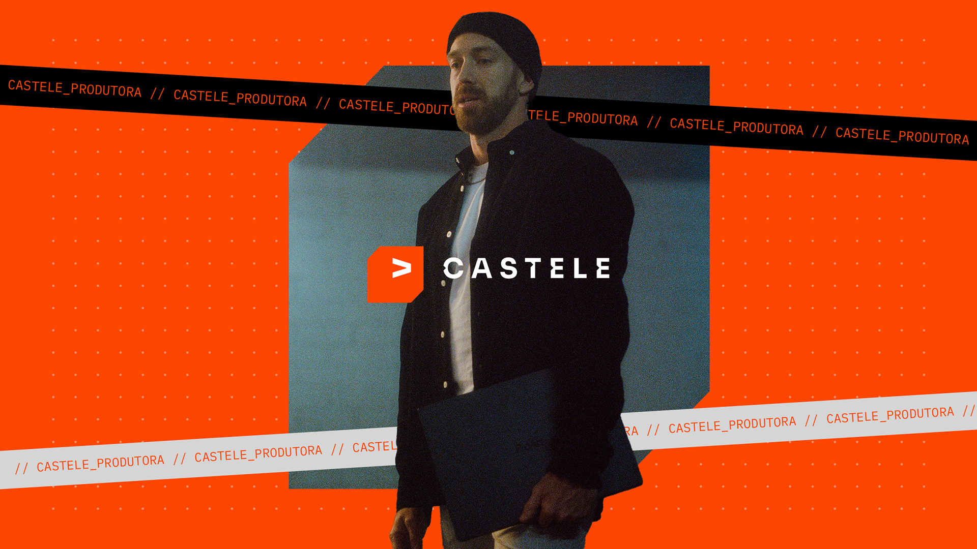
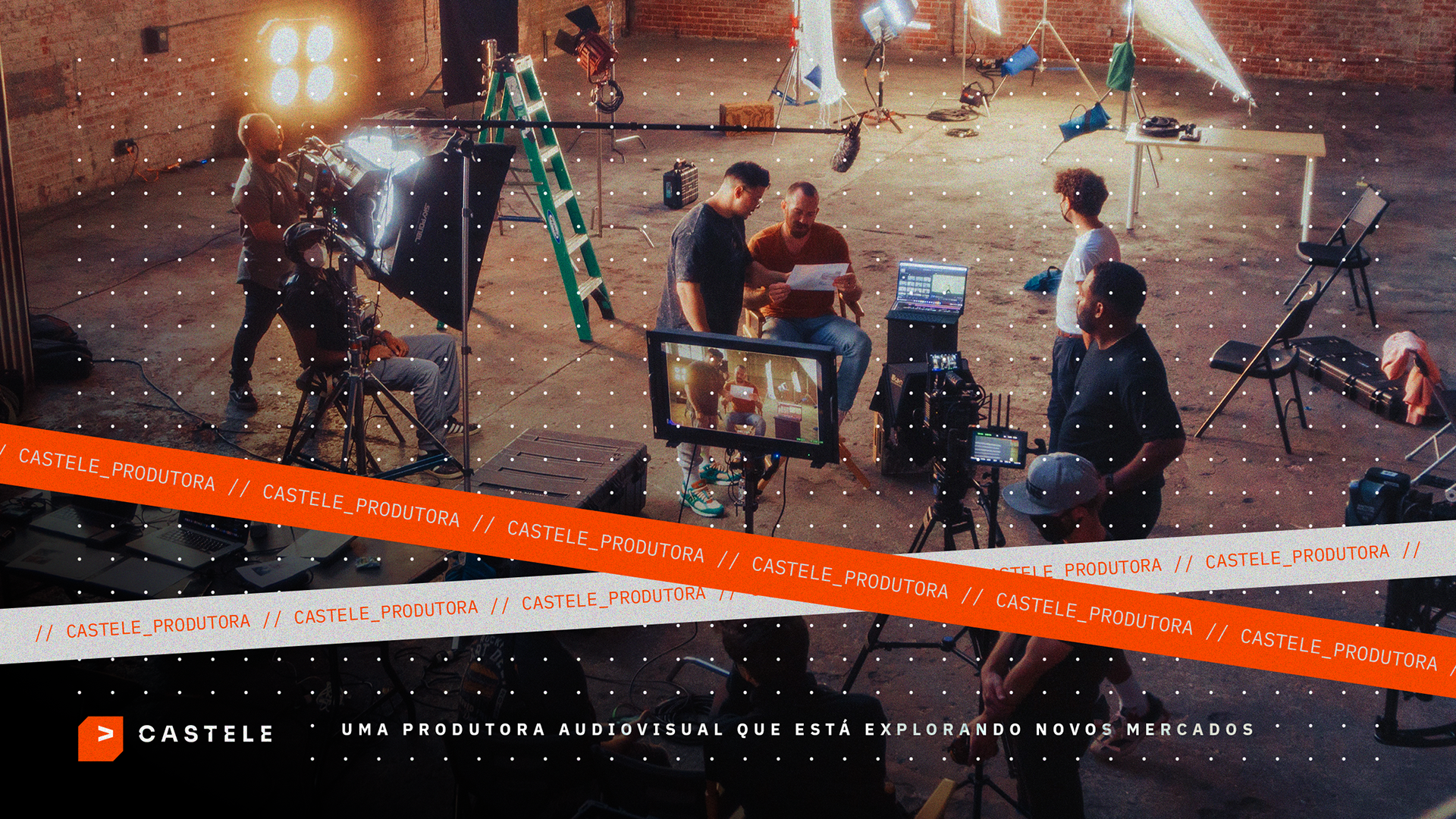
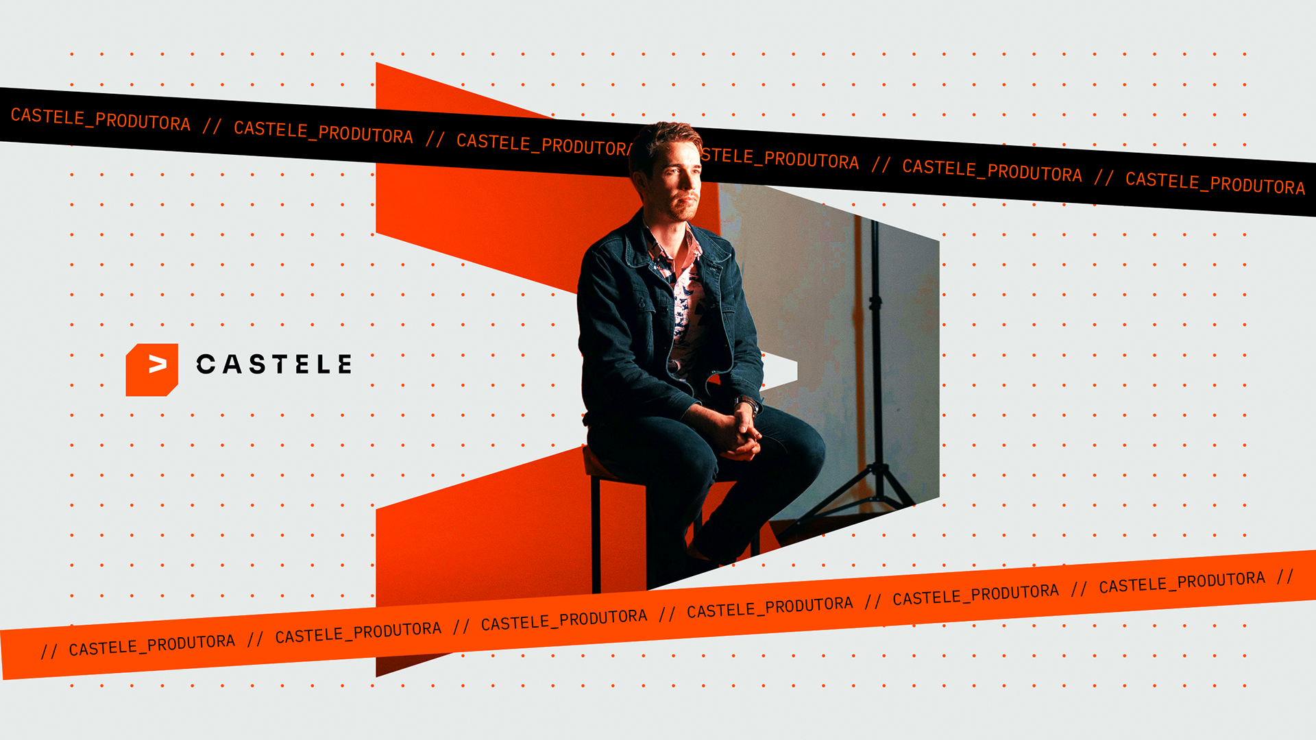
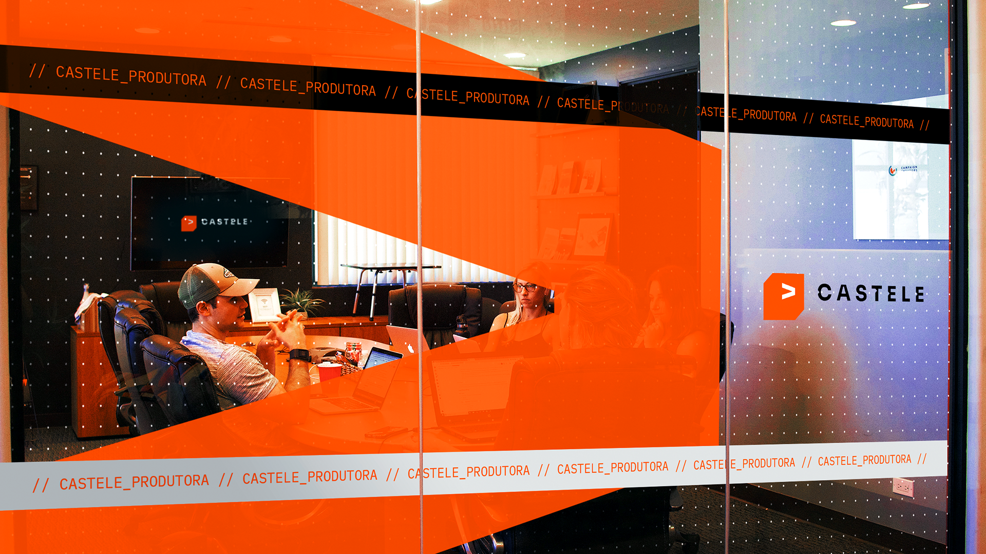
Castele is an audiovisual production company that is exploring new markets. They bring to life of their clients' unique vision, crafting an iconic narrative that is a true magnet for the eye, unlikely to go unnoticed, and too magnificent to be forgotten. The challenge of this rebranding project was to convey a brand that exudes credibility, trust, innovation, and creativity.
A Castele é uma produtora audiovisual que está explorando novos mercados. Eles manifestam a visão singular dos seus clientes, construindo uma narrativa icônica, sendo verdadeiro ímã do olhar, improvável de não notar e magnífico demais para não se lembrar. O desafio deste projeto de rebranding foi transmitir uma marca que passe credibilidade, confiança, inovação e criatividade.
About the Project
Concept
'Castele' is a slang term widely used in the city of Sorocaba, in the interior of São Paulo. 'Castelar' means to observe deeply, to notice things that one wouldn't perceive in a normal mental state. Later on, this slang began to spread and simply became synonymous with observing, noticing, and paying attention.
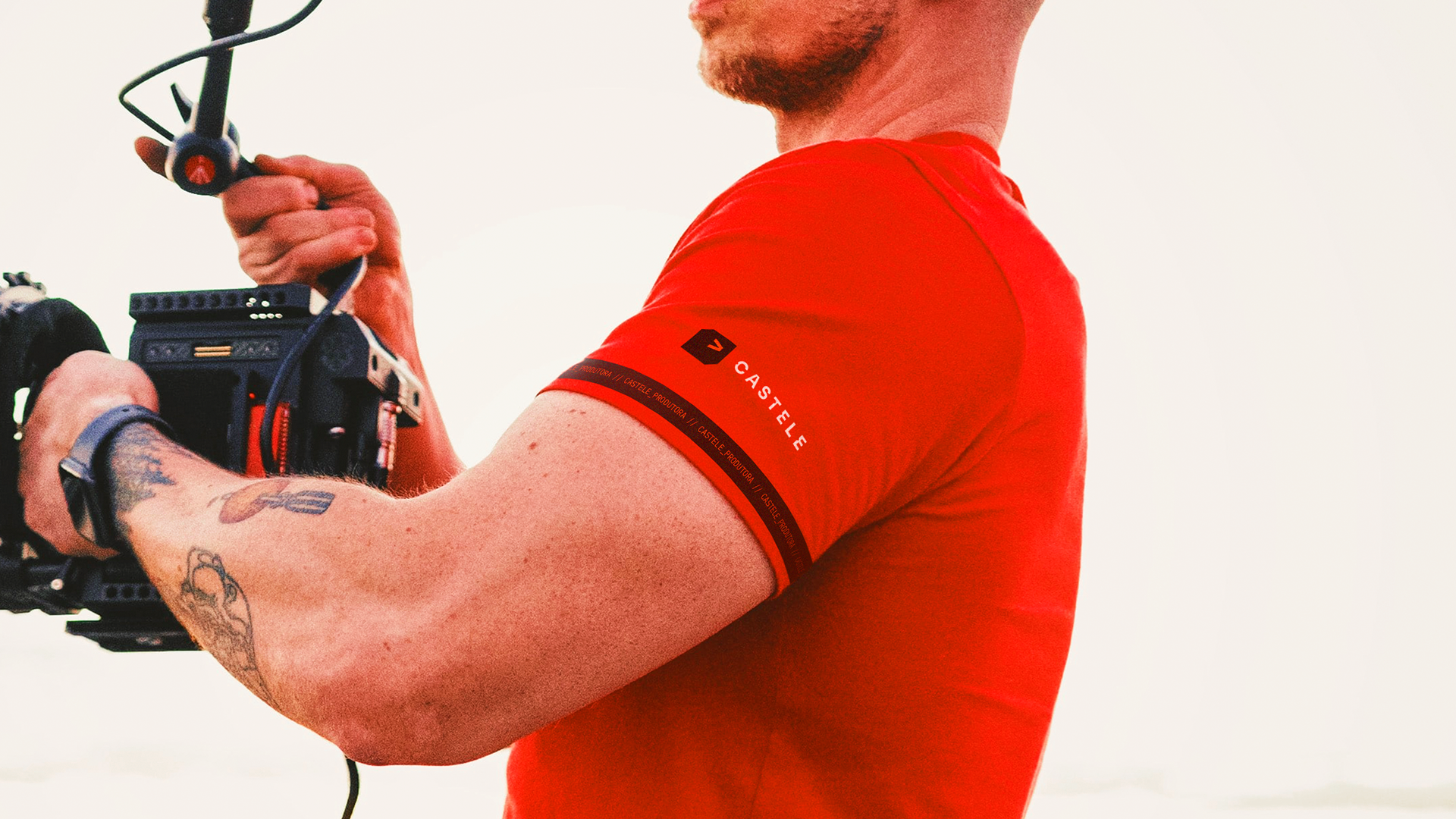
As a production company, Castele needs to be the one that observes deeply, capturing things beyond the ordinary, what people would not typically notice. We can say that this is the essence of the brand, its unique selling proposition. What it can offer to its clients.
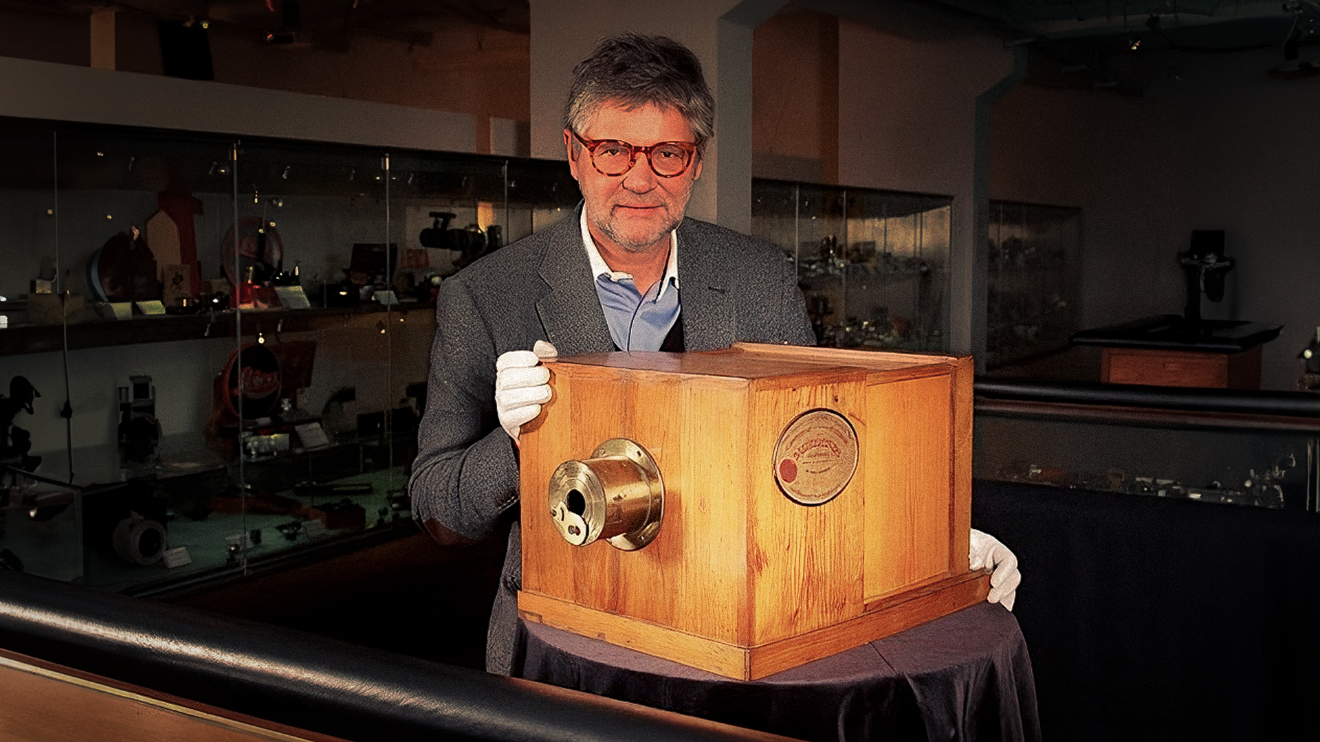
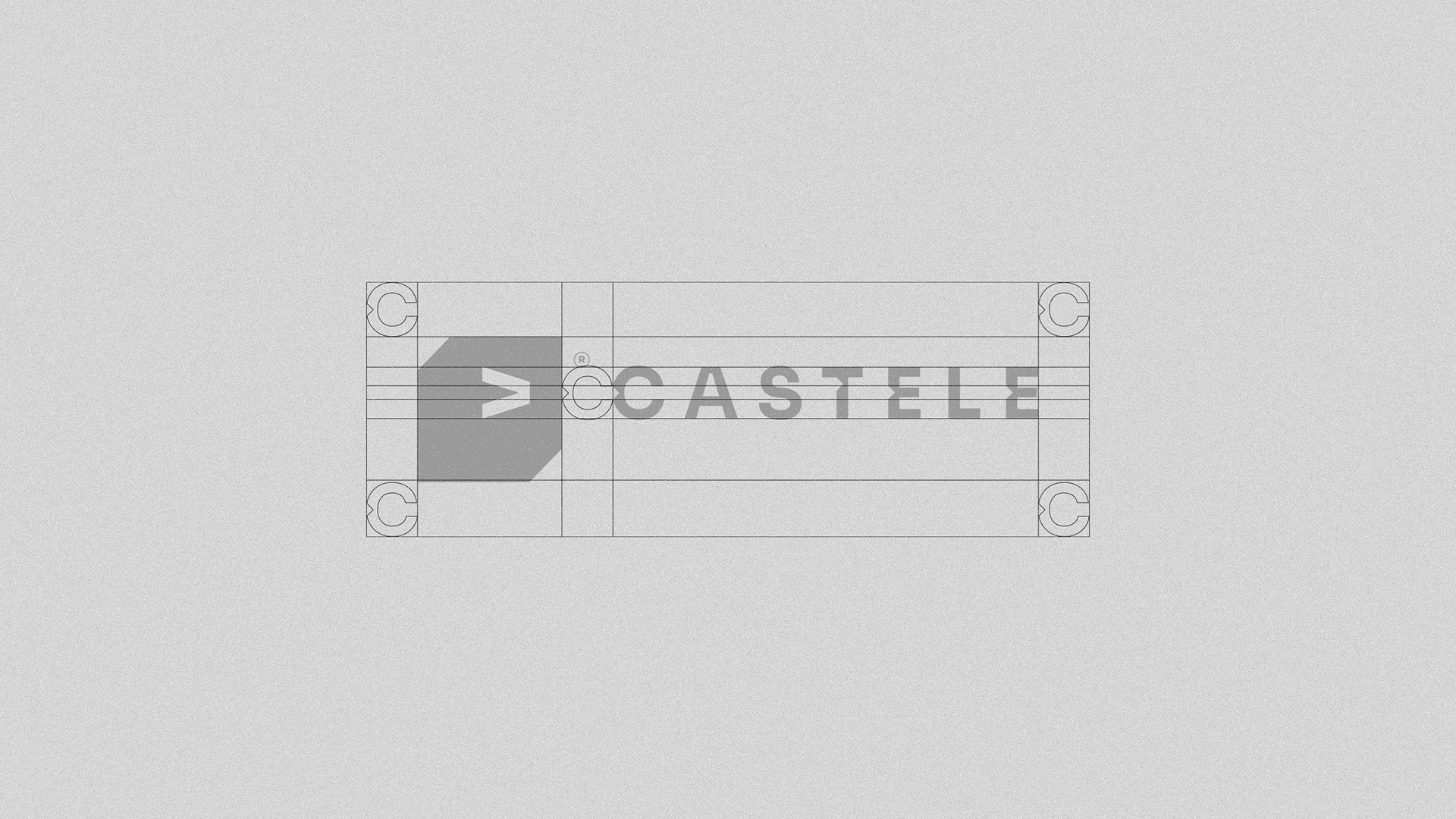
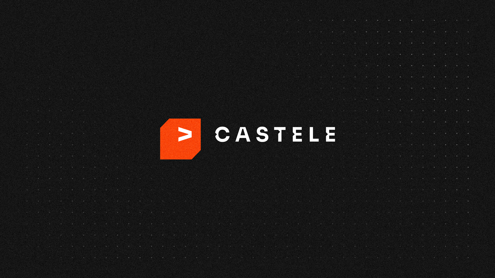
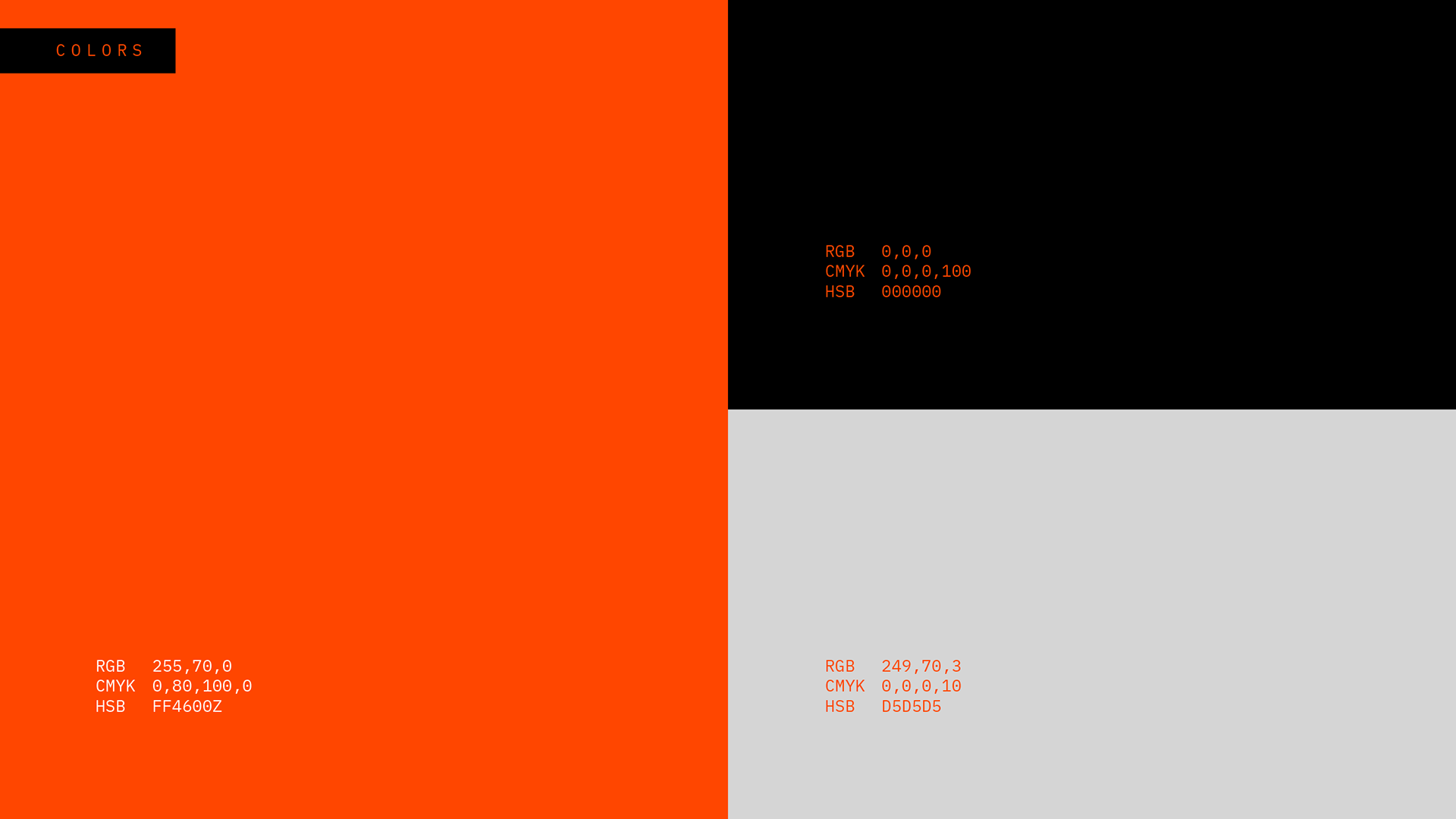
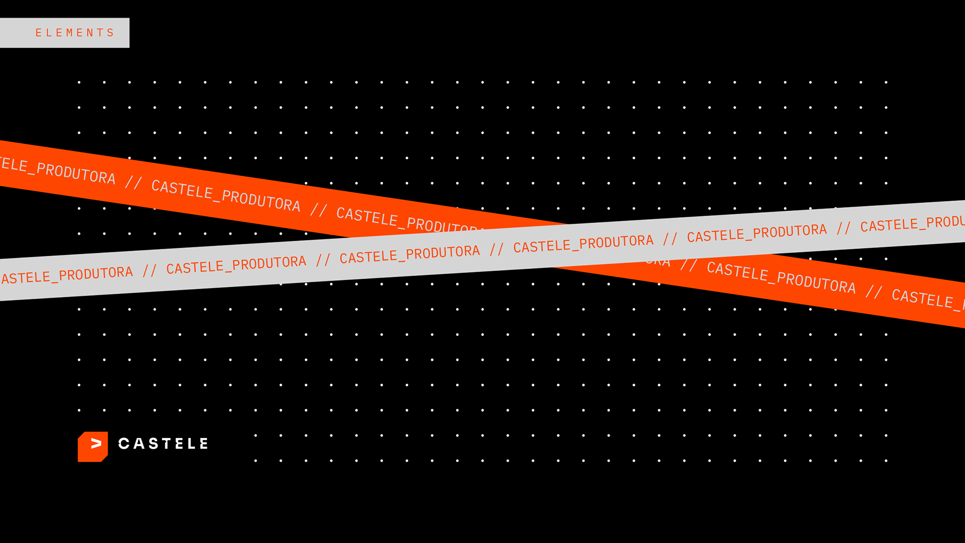
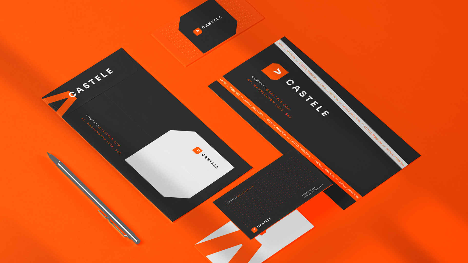
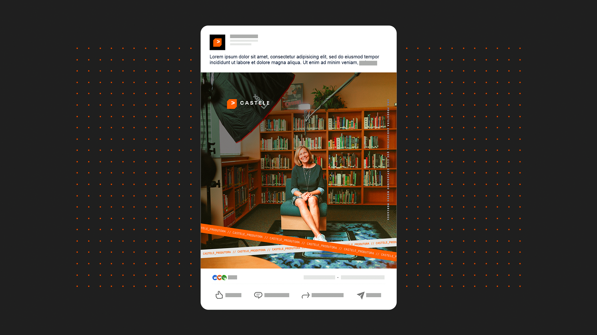
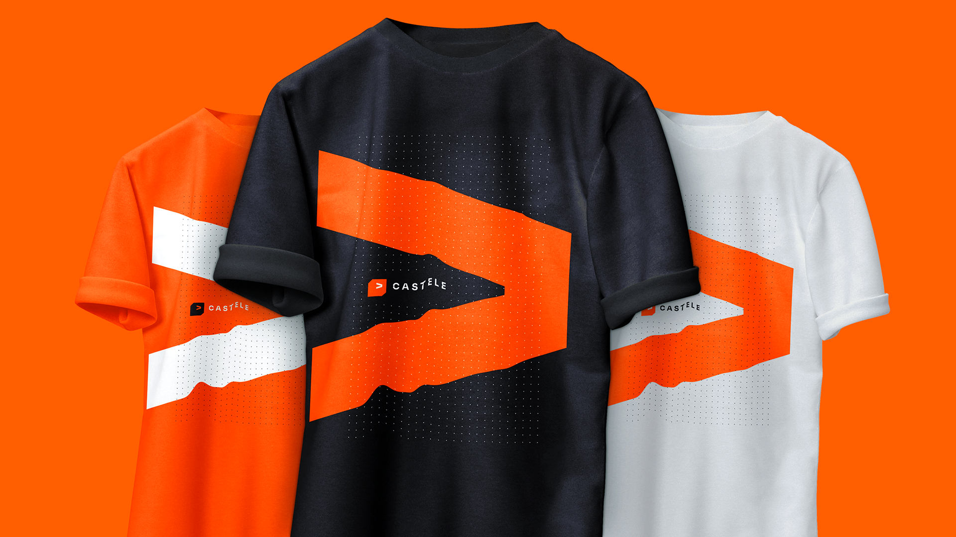
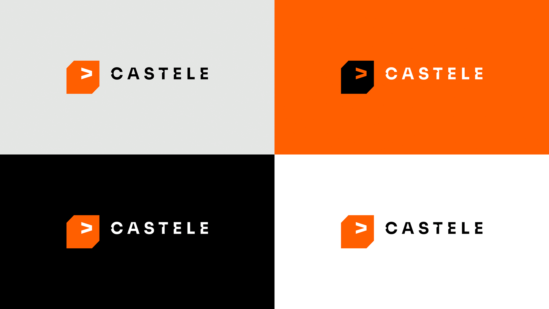
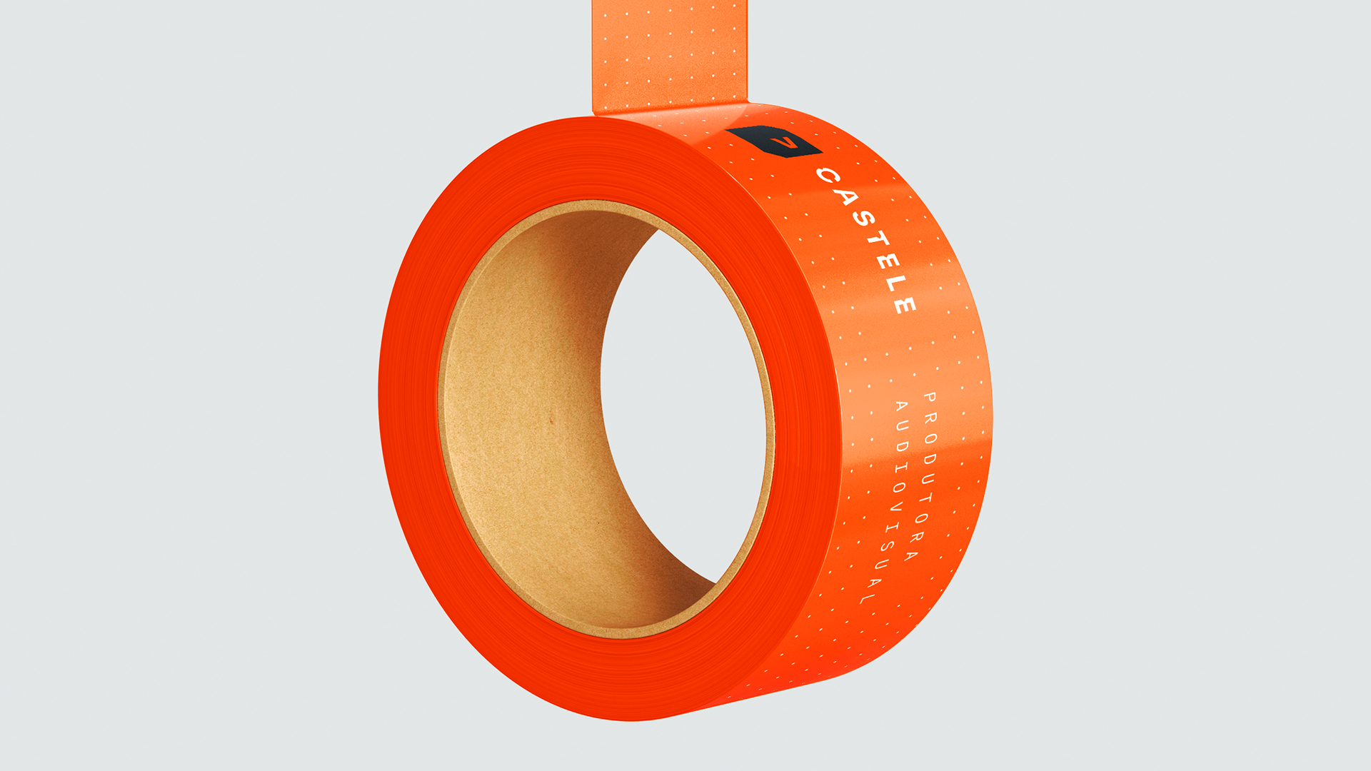
The proposal was to bring this concept to the icon as well, using the arrow as an indicator of the gaze, a direction. The box alludes to the daguerreotype, the first commercially manufactured photographic equipment in history, as a reference to the origins and also conveying a brand as innovative as this equipment was. The colors convey the creativity the brand needs, and the dots as a visual element refer to the focus point of a camera.
"Castele" é uma gíria muito utilizada na cidade de Sorocaba, interior de São Paulo. "Castelar" é observar profundamente, perceber coisas que não se percebe num estado mental normal. Mais tarde essa gíria foi se espalhando e se transformou apenas em observar, reparar, prestar atenção. Como uma produtora, a Castele precisa ser aquela em que observa profundamente, capta coisas além do normal, o que normalmente não notariam. Podemos dizer que esta é a essência da marca, seu grande diferencial. O que pode oferecer ao seu cliente.
A proposta foi trazer isto também ao ícone, utilizando a seta como um indicativo do olhar, uma direção. A caixa remete ao daguerreótipo, o primeiro equipamento fotográfico fabricado em escala comercial da história, como uma referência às origens e transmitindo também uma marca inovadora como este equipamento foi. As cores transmitem a criatividade que a marca precisa, e os pontos como elemento visual são referência ao ponto de foco de uma câmera.

Graphic Designer / Art Director: João Berbel Client: Castele Agency: B2UP